ShopDreamUp AI ArtDreamUp

Deviation Actions


Description
[UPDATE]
Now available as a print!
----------------------------------
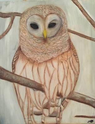
Traditional ink, acrylic pearlescent ink, and acrylic.
You can see a close-up here: [link]
-----
Also in my gallery...


Now available as a print!
----------------------------------
Traditional ink, acrylic pearlescent ink, and acrylic.
You can see a close-up here: [link]
-----
Also in my gallery...
Image size
750x1203px 1011.61 KB
© 2009 - 2024 LisaCrowBurke
Comments61
Join the community to add your comment. Already a deviant? Log In
Your use of colour and level of detail is top notch for this piece. Emphasis on “use” as it is applied to draw attention to those eyes. My god, those eyes!!! Brilliant.
I find brown to be a good compliment to blue. It’s supposed to be neutral, but in terms of comparing it to hues on the spectrum, it tends resemble warmer colours like orange and red. Everyone knows orange is the complementary of blue, so brown’s “kinship” to it complements blue quite well, and since it’s duller and neutral it doesn’t demand attention away from it.
The affect is striking when you’ve filled the image with soft blues and browns, and then in defiance those eyes show up sporting a striking and bold golden yellow.
For detail, you’ve used softer, longer strokes for the exterior, but as you close in on those eyes, the strokes become harder, tighter, and smaller; your values become bolder in contrast, and lines appear a bit sharper.
The pearlescent acrylic is best used on the tail feathers, which gives the impression of catching the light coming of the snow on the ground.
This is awesome.